Sunday, 22 December 2013

Location Permissions


These are the location permissions, as York Road Primary school was unsuccessful in us not being able to use it we will use our school and dress up a set, we have agreed with the school already. As for the London location that would involve us having to pay an insurance fee that is not covered by school, so therefore we will replace this location with one in Swanscombe that is already obtained as a member of our group owns the property. These permission replies have helped in deciding the best and most suitable locations for us to use when we film the music video. This also helps in being prepared as we now know the locations we will use when we shoot.

Friday, 20 December 2013

Rough Cut Music Video


This is the Rough Cut of our Music Video. We all contributed to the creation of the Music Video, and edited individually. Sophie did the first 1 Minute of the editing, Deborah did the second Minute, and David the the remaining 55 Seconds. This clearly shows our skill in editing and how well we can edit.  

Wednesday, 11 December 2013

Digi-Pack Rough


Initial Ideas

Originally, I wanted to use the lone pawn piece as the CD face, but it wasn't until I had fully constructed it, that I realized it would be better as a front cover. Below are examples of I constructed it on Photoshop. 


Final Cover (Draft) 

In the end, I chose to use the original images meant for the inside, for the outside part of the Digi-Pack. I felt it looked much more professional if it was done this way, as it invoked a sense of mystery and some sort of suspense in  the Image, and it can act as a Visual "story"of what may occur in the video. Moreover, the cover was chosen due to an idea i had. Since there was already a Sub-Culture of teens that are interested in the Twilight franchise, the cover may attract them especially, and boost both the Niche and the sales of the artist, if it were put on a CD stores shelf. 

Filming Evidence & BTS


Video Diary 2


Friday, 29 November 2013

Call Sheet

The Task:

In order to prepare and plan our filming days, I was tasked with creating our call sheet. This document will be used by our actors and ourselves in order to let all people know what days they are needed, Important details that need to be known, Numbers of actors and producers are on hand and available, along with solutions should the person in question not be available through a particular means. This sheet will ensure that we will not be delayed in anyway possible, as it informs all those that are taking part whether they will be needed on set days and goes hand in hand with our Production Schedule (please click the Link) which goes into further detail about these arrangements. 


In conclusion, this task will aid us when we begin filming, and provide means and ways for us all to contact one another should any difficulties arise and quickly begin shooting once they have been resolved. Moreover, this task shows how well we have planned our production, and worked out the necessary means needed in order to carry out the task of filming our Music Video.

Production Schedule


Production Schedule


5th December is reserved as a day to re-shoot any parts of the music video.

This is our production schedule detailing our plans in shooting from 2nd to 5th December, along with estimates of how long everything should take in terms of filming. This enables us to be more prepared and planned when we shoot our music video.

Location Report (Reece's)

Tunnel
The tunnel has a dark sinister look whilst having sufficient lighting, few members of the public walk through so it is quite a suitable filming location. It also conveys the poor lower class look we are looking to show in the video through the protagonist (teenage boy). Its quite spacious whilst still remaining a normal sized tunnel and has an alleyway type of design. This enables us to not be limited with the types of shots we can do. The tunnel would also protect camera equipment in-case of rain. Depth of field can be used very effectively in this location, due to the narrow long appearance the tunnel has.

 Estate
This is quite a film friendly estate in which also allows a large amount of light due to it being spacial and not too busy. Although next to a road, as we have no dialogue in our video this is not a problem. The estate also conveys the lower class look we are going for to represent where characters live in the video. The area is quite well lit in the night, and during the day we can use our own lights as well when lighting the set. We do not need to dress the set our physically put anything anywhere on the estate and this is helpful in not causing problems with residents of the estate.

Back-up Tunnel
This tunnel is very similar to the first one but is more brighter and in our music video it would be in-congruent to what we are visually going for with cinematography. We could still control the music videos lighting through our own lights but this would more difficult in comparison to our first choice tunnel. Like the first tunnel its visually good whilst still looking poor and dark. The tunnel would also protect camera equipment in-case of rain. Depth of field can be used very effectively in this location, due to the narrow long appearance the tunnel has. This area is also spacious in not limiting the types of shots we can do.

Back-up Estate
Although this estate is visually better in showing a lower class location, it has much more residents that will inevitably effect our filming. It is well lit, but certain shots like a straight mid shot on the estate is quite difficult due to its size, even with a tripod. This location is also very spacious, so even though it has more residents who will be walking around often, we could film certain parts in different parts of the estate.

The reece's done help in deciding which locations are suitable for certain scenes. This will help in locations representing the mood desired throughout the video. Also these locations can help in communicating messages to the audience in relation to characters, that might not necessarily get conveyed within the videos narrative.

Thursday, 28 November 2013

DIGI PACK FONT EXPERIMENT.

To prepare for the creation of our digi packs I decided to experiment with font types that we will later use. I also created s log of every font used in this order to refer back to when the group decides on a final choice. The font will have to represent our over all image and theme and draw in the audiences attention. 

Digi-Pack Draft

The Task:

The Digi-Pack is an essential part of our project, in order to promote our band we would need to have  a suitable set of images that defines, represents and suit's our band and target audience. It will also need  to both promote and suit our Music Video in order to keep the theme relatively simple and not divert away from the Image we have set. Furthermore, to show understanding, the use of camera work, editing and directing, this task enabled me to experiment and follow some of the previous ideas I had (Please follow the Link) when planning the pack. 

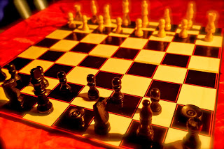
The idea for the chessboard was to create an enigmatic atmosphere. I decided to enhance the colouring by using the edit tool to make it seem "richer" and rather "old" in the same instance. My reason behind this was to ensure it had an  almost vintage look, and the use of lighting in the room, and the enhancement, makes the chessboard more noticeable  when one looks at it. Furthermore, the yellow lighting suggests an odd sense of warmth in the image, and combining that with the red cloth suggests further the use of demonic powers behind it, as red and yellow are often used to symbolise the fires of hell. On the other hand, I used the blur tool on the edges of the image, so that it would seem surreal, appearing neither real or real at the same time, so that the audience focus on it more and begin to possibly question its origins and why it has been placed so mysteriously in the image. The mere fact that it is sitting on a piece of red cloth is to emphasise the idea of danger, or rather, the idea that a demonic force is at work in the shot. 

The lone pawn serves as several different meanings in the Music Video, and in this particular  shot, there is even more emphasis on it. The idea of it being on its own represents Isolation, and since our main character is isolated from the world (mentally) the shot lays emphasis on this by it being the piece that is both focused on and away from the rest of the pieces. The mere fact that the pawn is away from the rest of the pieces represents two things: Loneliness and Rejection. Since the pawn is not with the remaining pieces suggests that it stands alone in the world that is the chess board. And as such, is target or "practise" for the opposing chess pieces, more specifically, the Queen piece. On the other hand, rejection is emphasised by the mere fact that during the filming of our production, the other pieces on the white-side (unless they are pawns or the Knight piece) do not step in and protect the pawn, or even take part in the battle, suggesting that they have rejected their own "member of society" And is further emphasised by the fact that other white pieces can be seen in the background, suggesting that they are watching the pawn being abused. The Loneliness, Isolation and Rejection of this piece is further emphasised by the use of light giving the pawn a shadow. This lighting further creates an uncomfortable warmth in the image, and the darkening of the edges of the image suggest that the darkness is closing in on the pawn, preparing to possibly "devour" it. Also, Since I wasn't too sure on how to edit in a black circle (as I wanted this image for the album/CD face) I resulted using this blacked out edges to help me represent how it would appear on the face of the CD. Furthermore, I have blurred the background, in order to make the pawn the central item of focus in the image.
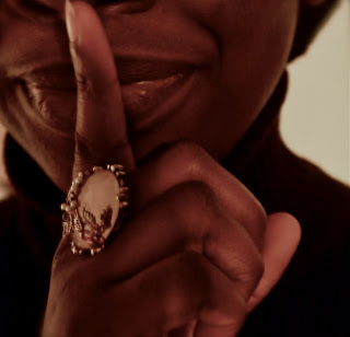
The mysterious woman (myself) in the image is a source of perplexing and overwhelming power in the Music Video.  She is the one person with the most influential power in the video, and is constantly moving the pieces in the duration of the video, and as such acts as a catalyst in the entirety of the production. A noticeable trait about her in this Image is the fact that she is wearing all black. Black symbolises darkness universally and suggests her lack empathy, and cruel nature. Furthermore, her own chess piece is black on the chessboard, further acting as a foreshadowing for the audience. Moreover, I chose to smile in this particular image to show that she enjoys turmoil, and presents her further as a sardonic sadist that takes pleasure in other peoples pain. On the other hand, as our character in particular was to have red nails, to act as a foreshadowing of who she may be or is,  my own nails were not red, so instead I chose the ring to replace this, and often, a ring is seen as an object of wealth and power to many, further emphasising her own supernatural abilities.  I chose to have my finger on my lips to represent the keeping of an unknown secret that no one but herself is aware of. Furthermore the ring in this image is central, due to it being the only thing that serves as means of identifying our enigma and gives the audience an early clue as to who she is.  The lack of light in this image is important, as it suggests, further, that she is not any means good, but rather, a being of unprecedented darkness. Furthermore, the lack of light suggests that (unlike that of the other images) she is not in anyway affected by the light (fire) as the chess pieces are, and suggests that she is  a higher being, The Devil. 

The Image of the Devil and the chessboard, suggests foreboding, or rather, the preparation of it, as the Image presents the white pawn as the only piece that is not in line with the rest of its kind, suggesting that it is either left on its own to fend for itself, or rather, the pawn is challenging the Devil and refusing to stay in place, like the rest of the pieces. The Devil's own body language suggests this, as this refusal to stay in place takes the Devil out of her comfort zone, and the only way she feels to put this subject back in place, is to have opposing pieces destroy it. Alternatively, this image could also be merely viewed as the white pawn being placed (almost) within the centre of the chessboard, as means of observation for the Devil. This immediate interest the Devil takes of the pawn suggests a possible foreshadowing that this mysterious person and pawn have a unique "relationship" and the obviousness of the arms and the pawn in the image, further fuels this idea. The location of where the pawn was placed is key in this image, as it shows the audience that since it is sitting on a black square, it is therefore on the territory of the black pieces. Furthermore, the placement of the arms was intentional also, as I wanted the ring especially to be taken note of, and add to the continuous enigma of the Devil's identity. The lighting in the image is the same as before, with enhancement used to add  a yellowish glow to the image and suggest the temperature of location, and add a clever use of shadows in the picture. Furthermore, unlike the other images, blur was not used at all in this image as I wanted it to appear sharp, yet retain an almost aerie feel. Both the chessboard and the enigma's arms and ring present this well, as it creates a shallow yet disturbing presence in ones mind due to anonymity and mystery presented.     

The significance of the Devil holding the pawn is relatively straight foreword. This merely adds further to the idea of the enigma observing this piece as an anomaly in the face of all the other pieces in the image. I have chosen to edit this image very differently to the other images, and I wanted to give it a vintage look with shadows being a prominent feature and theme in the image. The edit i used for this is called Sepia, and allowed me to gain access to this authentic look and use shadows as means of representing the dark matters that is to arise later on in the Music Video. Furthermore, the use of the mysterious character holding the pawn suggests how vulnerable it is. Reflecting the very character in question. 
In conclusion, this task acts as an example of my ability of editing skills, shows how effective I am at drafting a Digi-pack. This task shows my interpretation on how I want our Digi-Pack to look, and what kind of techniques we can use when creating the atmosphere and mood of the image.  

Digi Pack Sketch/Draft. Sophie.


FRONT COVER: For the front cover of our digi pack, I have chosen to feature the main abused boy from the music video. I plan to enhance shadows and create a soft faded checkered background behind the boy, continuing an ongoing theme of chess, games and childhood. The picture expresses vulnerability and isolation, a major theme of the song. Only half the boys face will be feature, almost like he was hiding. The same make-up used in the video will be present and the title of the main song will appear as the album title. 
BACK COVER:  Chess is a major component in our video, representing childhood, games but also intelligence. By choosing to use a lone pawn, we stick to the ideology of isolation and the colour scheme of black, white and red with shadows. The songs titles will be over-layed onto the chess piece so the white will contrast with the black text. 
CD: The design on the CD itself will be simple with the checkered pattern, continue our house style. 
The name of the band will be featured on the CD.
INSIDE: For the last image I choose a simple image of the boy walking alone. The same colour scheme will be used with defined shadows. 

This is my interpretation and ideas for the digi pack. By creating rough edits/ideas I have a clear mind set of what I want to create for final digi pack and what to pitch to the rest of my group when we being creating the final product.


LOCATIONS.


The home owner gave us their consent to shoot and photograph the location, so that we may begin our filming.    

We used one of our producers (Sophie's) house as location to film. the reasoning behind this was because her home had a strong working class look on the inside, due to it being quite small, and we would be able to dress this set in order to give a more rough, rather raged look, to suit the characters  so that when it comes down to us filming scenes of violence in the home, it will match and create a suitable atmosphere.    


Since Swanscombe has the stereotypical working class look, we felt that we could use it to our advantage once we began filming, since our main characters lived in such an environment we wanted to be able to use outside shots effectively also. 


This task was completed by Deborah Akinkuolie and Sophie Butcher. Sophie collected the pictures of the locations, and I explained them.